Hardback
Exceptional
Free in Modulify
You can clone, edit, and host in modulify.ai
More sections
Explore the collection
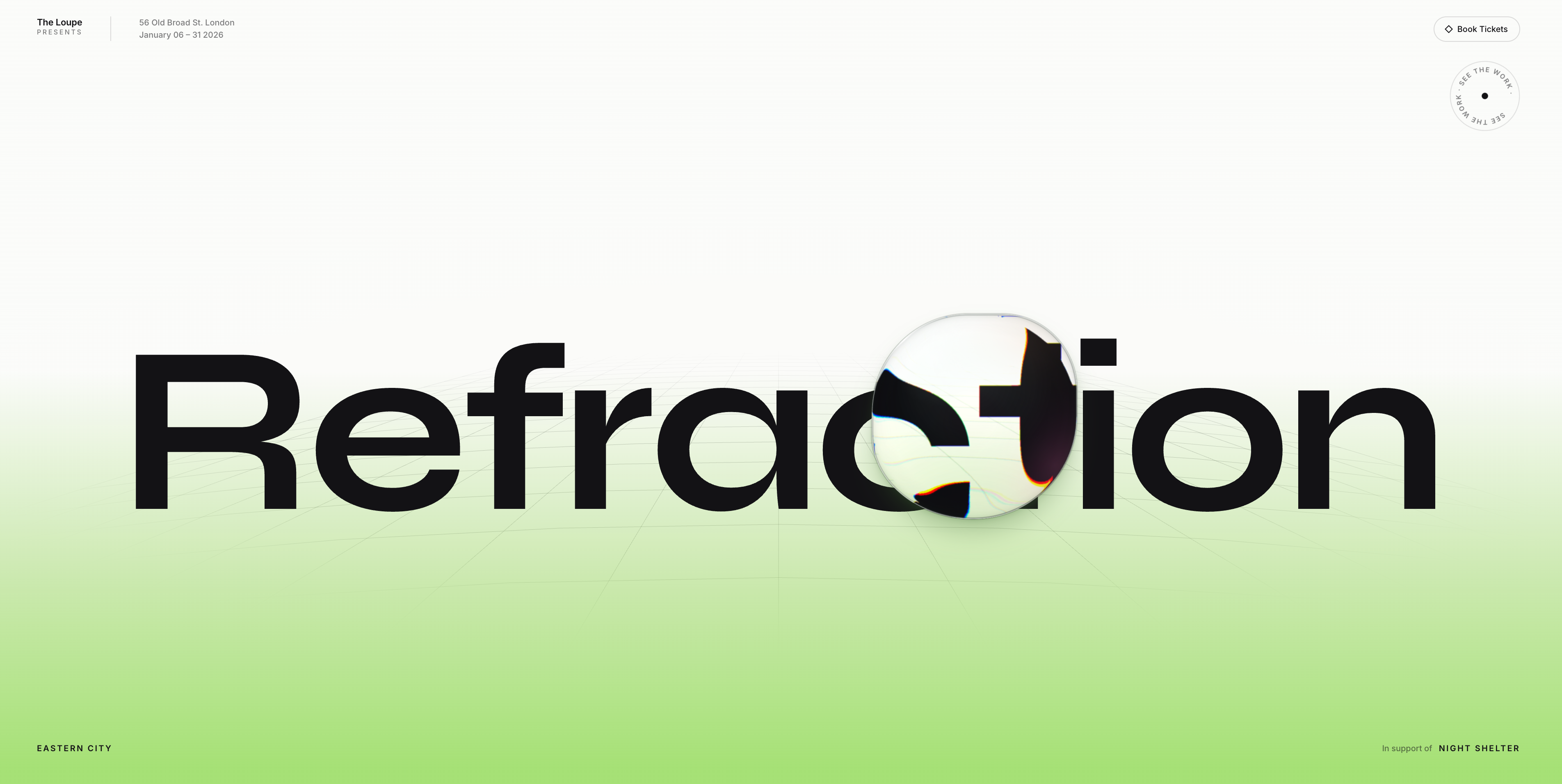 LoupeA full-viewport hero held on ONE frame: a masthead, one enormous line of type, a measuring floor — CURVED, lying on a swell so its rows BOW and its rays SPLAY, and shown only where the word is — receding into a BRIGHT LIME-LEANING GREEN ground that SWELLS slowly up toward the type and settles back, the lattice itself DRIFTING toward the horizon, the ground flowing away, which gives a held frame a direction to sit still in — and a bead of living glass that drifts across the words and BENDS them. The floor's swell oscillates rather than drifting one way, because the lattice can drift forever — it repeats, so translating it by one cell wraps invisibly — while a gradient has no period, and a one-way drift would either run out of colour or need the whole ramp rebuilt every frame. A CSS plane cannot curve at all: a rotation is affine, and an affine map takes straight lines to straight lines however deep the perspective, so the lattice is drawn as SVG curves instead. The whole surface is two lines of arithmetic over the perspective foreshortening, and the EXPONENT ON THE BOW is the entire trick — at one, both axes are affine in that foreshortening and every ray comes out dead straight no matter how hard the rows bow, so only a value above one bends them. The drift is a PHASE ON THE DEPTH INDEX rather than a translation, because the rows genuinely recede and their spacing compresses as they go, so sliding near rows and far rows at one speed tears the perspective apart; when the phase passes one each row inherits its neighbour's place, and the wrap is seamless with no spare cell. Only the rows move — the rays are fixed in the surface and are built once — and rows FADE OUT with depth, because spacing by one over z eventually lands them closer together than a hairline is wide and they merge into one grey smear across the horizon. The cost is the lesson: rewriting a row re-rasters the whole layer, twice over, measured at more than five milliseconds a frame against a sixteen-millisecond budget, by far the most expensive thing in the piece. But the drift is slow enough that one row takes thirteen seconds to hand its place to the next, so fifty-nine of every sixty redraws paint the same thing — redrawing at a QUARTER of the frame rate is identical to the eye and puts the lattice back inside the noise, because untouched frames re-composite the cached layer for free. Crop the layer first, then stop redrawing what has not moved. The floor is the ONE place the frame spends its colour, and it is not greyed — it runs to a chroma of a hundred and thirty at the bottom edge, which is bright enough to read as neon-adjacent and stops deliberately short of acid. Three things keep that inside the house rule against saturated colour: it is a GRADIENT rather than a field, so the top two thirds of the frame is bare near-white and the average the eye reads is pale; it stops short of the point where a green goes yellow and turns into a highlighter, which is about twenty points of chroma further on and is visibly a different, harsher thing; and NOTHING ELSE COMPETES — the bead stays clear glass, the type is near-black, the chrome is grey, because one saturated element in an otherwise desaturated frame is a focal point while two is a palette. Pick a value like this by rendering the candidates side by side rather than by nudging one number, since the difference between bright and acid is not predictable from the numbers. Every neutral in the frame is mixed off the floor's hue, INCLUDING THE BLACKS: the bead's contour, its cast shadow, its body shading, the dark arcs of its rim and the flat ground the band fades into were all struck off the ground colour, and re-hueing the band alone leaves a purple object sitting in a green room and a violet-cast near-black stacked above a green floor like two different rooms. They are carried across at the same luminance instead. The floor's swell is a transform on an inner sheet rather than an animated background position, because position is a paint property and animating it would repaint a viewport-sized, masked layer every frame, twice over, since the lens holds its own copy of the scene. The word writes itself in A LETTER AT A TIME as the page loads, each letter scaling, unblurring and rising on a stagger — and the lens's own copy of the letters is tweened separately, because one stagger across a flat array of both would deal the delays out in DOM order and the word inside the glass would lag the word outside it by the whole reveal. The line is split for that reveal but MEASURED off an unsplit, unpainted ruler kept beside it, since a range over split letters returns their line boxes rather than the glyphs' ascent and descent, and those boxes move the instant the reveal transforms them. There is no sequence, no gallery and no scroll — the whole piece is the glass and what it does to the type underneath it. The bead is a LIQUID FORM, never a circle and never the same shape twice: an eight-value border-radius whose every corner breathes on its own incommensurate period, and a drop that ELONGATES along its heading as it moves and relaxes back to round as it settles — mass resisting a change of direction, which is what actually reads as liquid. The outline is a border-radius rather than a clip-path on purpose, because overflow, the rim's inset shadow and the cast shadow all follow a border-radius automatically, so the outline, the clip, the lit edge and the shadow stay welded together; with a clip-path the rim would trace a circle while the shape moved out from under it. IT ENGAGES ON THE TYPE: away from the words it is clear glass, magnifying nothing because there is nothing under it worth bending, and reading as a quiet disc resting on the page; bring it into the letters and it becomes a lens, with the magnification, the rim compression, the dispersion and the surface modelling all swelling in together, driven by DISTANCE to the line's ink box rather than by a boolean so nothing snaps on at an invisible boundary. At rest both magnifications reach exactly one, not nearly one — the copy is a duplicate of the world sitting on top of the world, so any other scale leaves a visible seam of doubled content around the circle. What makes it read as GLASS rather than as a soft flare is the edge: a second copy of the scene at nearly twice the magnification is masked to the outer band, so the world bunches up and bends against the rim the way it does through the shoulder of a real bead, and the two lights are masked to that same band so they split colour at the edge instead of painting over the middle — which keeps the centre clear and the refracted type legible, and the refraction is the subject. The hairline at the rim is a box-shadow rather than a filter, because every gradient is positioned in the element's box while the outline's radius swings as it wobbles — a ring drawn at ninety-four percent lands on the fattest lobes and misses everywhere else, while a drop-shadow traces the clipped alpha and follows the real edge whatever shape it is in. It refracts with the house's own optical engine — the one behind the Isle section — which models the disc as a glass slab whose surface curves down to the backdrop across a bezel band, refracts a straight-down ray at that surface with Snell's law, and bakes the lateral offset per pixel into a displacement map that an SVG filter reads. Two parts make the effect, and it needs both: a MAGNIFIED COPY of the scene supplies the enlargement, because a slab's interior is flat by construction and the map alone leaves the letters under the middle of the disc exactly where they were — and the map then bends and fringes that copy, hardest at the rim, so the word pools and curves along the edge of the circle the way it does through real glass. Chromatic fringing is three displacement passes at spread scales, each isolated to its own channel and screen-blended back; the centre of the map is neutral, so all three agree there and colour splits only where light really bends. The spread is deliberately kept BELOW the level where the primaries separate: that model was tuned over photographs, where mid-tones make a channel split read as prism, and over black type on a pale field the same setting produces near-pure cyan and orange slivers that read as a broken codec rather than as glass. One trap governs everything else here: the copy's layout origin is the DISC's origin, not the bead box's, and translating by the wrong one displaces the whole copied scene by about a fifth of its own diameter — more than twice the peak refraction — so the disc shows a different piece of the page from the one it is sitting on, and no amount of thickness, dispersion or magnification can make it read. Magnification and depth trade against each other: magnify too hard and the boundary reads as a cut rather than as a lens, so the enlargement stays slight and the BENDING carries the effect, which is the balance Apple's glass strikes. The map is applied as an ORDINARY filter rather than a backdrop-filter, which is what Isle uses — backdrop-filter with a url() is Chromium-only and fails silently everywhere else, while an ordinary filter is universal, so there is no browser gate and no second code path. Depth is a ratio of the diameter rather than a pixel count, because bending is set by the slab's proportions — and the slope, depth over bezel width, is what actually sets the strength: it runs at nearly twice the floor of the house's other glass, which is what the intensity rests on. Raising the bend forces the dispersion DOWN rather than up, because the colour fringe is an absolute width in pixels rather than a ratio: doubling the displacement doubles the fringe at unchanged dispersion, and the letter edges break into pure red and blue bands that read as a broken codec. The geometry is chosen by replicating the solver offline and sweeping it, so the displacement and the cost of a setting are both known before it is tried. Over the rim sits a border-only CONIC band aimed at a lamp fixed above the frame: its bright arc points at the light and its far arc goes dark, and because the lamp never moves while the bead does, the glint SLIDES round the circumference as the bead crosses the page — which is the cue the eye reads as curvature, where a highlight pinned at a fixed percentage of the disc reads as a printed outline. It has to be conic rather than linear: a linear gradient can only lay its bright band across a diameter, so it lights two opposite arcs equally and can never be dark on the far side. It carries no blend mode either — on a pale page a screen blend moves the pixel about two levels out of 255 and cannot darken at all, so the dark half would be a no-op by construction. The lamp sits outside the viewport on purpose: inside it, the bead could pass through it and the aim would invert through 180 degrees over a few pixels. Three soft lights — green, pink and a warm amber on its own slower orbit — turn inside the glass, each a six-stop gaussian falloff rather than a three-stop ramp, because three stops leave a shoulder where the curve changes slope and on a blob this large that shoulder reads as an edge of its own. Each light's box also has to OVERHANG the disc by more than its orbit reaches, since a radial gradient is cut off by its own element box: a translated light whose ramp has not reached zero by that edge prints a hard-edged square inside the circle, carrying whatever alpha the ramp had left. Three lights turn inside the glass; green and pink alone read as a two-tone gel, and the amber between them is what makes it look like light split by a prism rather than two gradients laid over each other — the same two hues in both themes, tinting by multiply on the pale ground and glowing by screen on the dark one, and kept under half alpha so the refracted type stays legible through them, because the refraction is the subject. The line is set in a wide, deliberately eccentric EXHIBITION FACE against a neutral sans for the small chrome — two families, the house split — which matches the register of the copy around it: a masthead, a ticket control, a turning SEE THE WORK. That face also happens to suit the optics, which is the part worth keeping: it is heavy and nearly monoline, and the bead’s three displacement passes fringe hardest exactly where a stroke is THIN, so the display line measures far cleaner through the lens than a neutral grotesque at regular weight did — a p99 chroma of forty-nine against a hundred and seventy-two, half a percent of the disc against nearly two. STROKE WEIGHT, NOT PERSONALITY, IS WHAT THE OPTICS CARE ABOUT: a light or high-contrast face is the expensive choice here whatever it looks like. The chrome stays in the sans, because it is ten-pixel labels and a display face there is all character and no legibility. Tracking is held just short of the point where the face’s splayed R collides with what follows it. And because a face change moves the METRICS — cap-height as much as width — the responsive audit is re-run after any swap, since a taller face at the same fitted width is enough to push the line into the turning ornament on a short landscape frame, where the ornament then yields. It follows the cursor with weight, and with no cursor it WANDERS the frame on its own, since a piece of glass that only moves when a mouse does is dead on a phone and dead in a screenshot. Nothing else in the frame moves with the pointer. The line is fitted to the width by MEASURING the string and solving for the size, because a font-size clamp interpolates against the viewport rather than against the copy, and it is placed by its measured INK on both axes — vertically because the ascenders overshoot the box and the platform's floating nav sits in exactly that overshoot, horizontally because side bearings differ letter to letter, so centring the box leaves the word visibly off-centre. The bead is sized off the SMALLER viewport dimension rather than the width, or a phone on its side gets a lid over the whole frame — and then capped against the width AFTER that clamp, so the cap wins over the floor and the bead cannot swell to nearly half of a narrow screen. Where the frame is short and wide the line and the top-right ornament want the same band, so the line's clearance is decided by the ACTUAL measured overlap rather than by a breakpoint — 667 by 375 collides and 844 by 390 does not, fifteen pixels of viewport height apart, which no breakpoint separates honestly — and the line drops below the ornament, or the ornament yields if there is no room for both. The ornament's box is measured from its LAYOUT geometry rather than its bounding rectangle, because it turns, and a rotating square's bounding box breathes as it goes round and would report a collision that is not there, intermittently. At the narrowest widths the credits' connective label is dropped so the line cannot wrap into two ragged rows. Carries a full light and dark theme following the site's control live, honours prefers-reduced-motion by standing the bead still rather than hiding it, and pauses off-screen and in hidden tabs.
- New
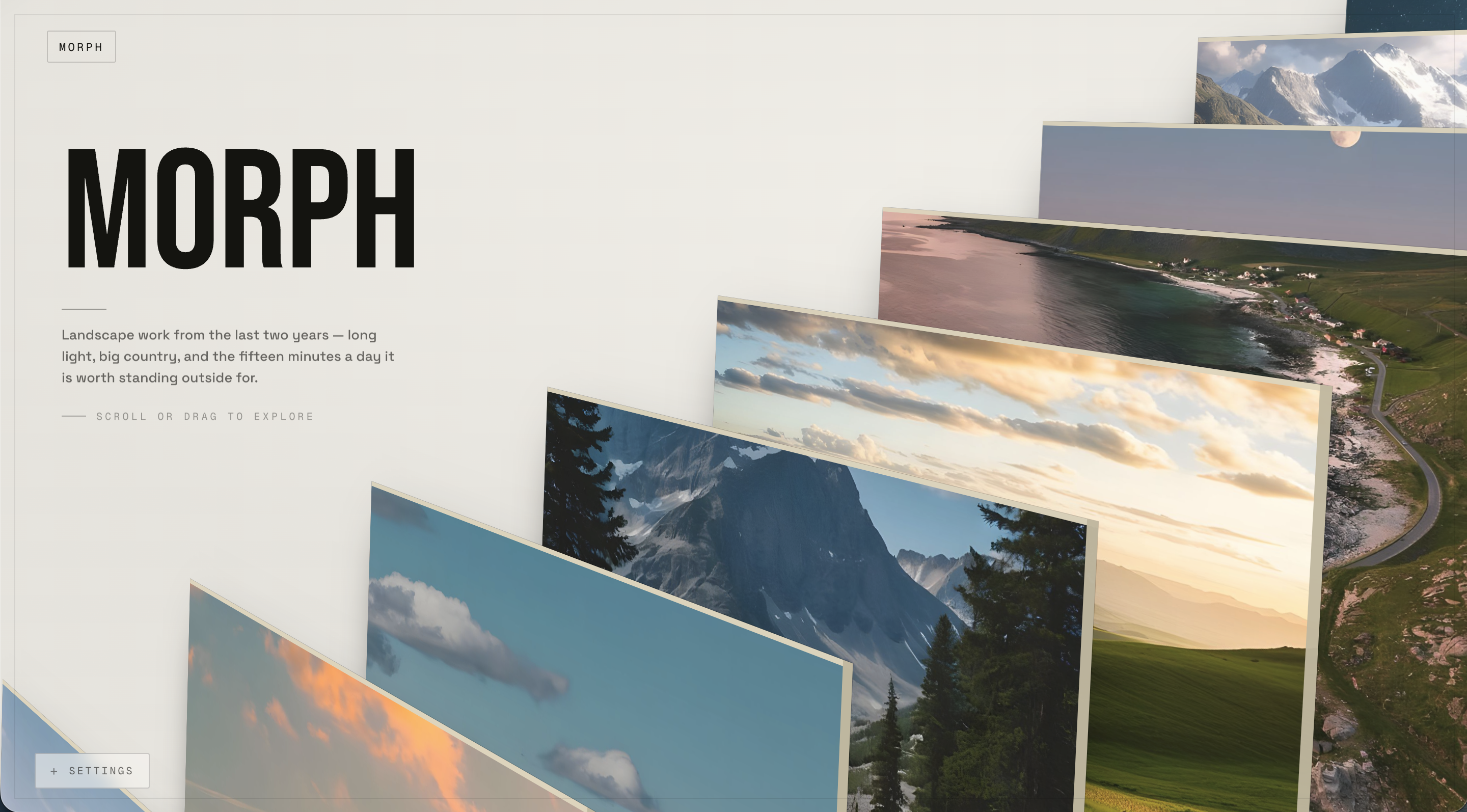 MorphA full-viewport photographic hang you scroll through forever. A dozen oversized prints stand on ONE straight line running away from the camera — each stepping right, up and back from the one in front, so the near ones are enormous and spill past the bottom-left of the frame while the far ones lie almost flat against the top-right corner. The hang is RIGID: every print is the same rectangle at the same angle, and a single perspective divide supplies the whole effect — the near ones lean about thirty degrees and the far ones lie flat, none of it faked per card, and because parallel planes cannot intersect the depth order can never go wrong. Each print carries the stretcher the yaw turns toward the lens: a warm bone edge along the top and the right, the top face grazed and the right face near square-on, so it reads as real canvas depth rather than a border. THE PAGE LOADS AS A HANG BEING PUT UP — the wall arrives one print at a time, nearest the lens first, each coming up from below carrying too much angle so you see its stretcher wide before you see the picture, then opening onto the shared rake as it takes its place; it ends composed because every print that lands is already in its final spot. Wheel, vertical drag or arrow keys CYCLE the line infinitely: the front print sweeps off toward the lower-left and a new one enters at the back, and the hand-off happens where the print is already outside the frame, so the wrap has no seam. Hover one and it pushes toward the lens and lifts out of the room's dark while the WALL LABEL in the left column becomes its label — title, location, year, and a caption that says what is actually in the frame. Click it and THE LINE PARTS: the prints in front run on down the line and off the bottom-left, the ones behind run up and off the top-right, and the split ripples outward from the work so the two halves peel rather than shunt as blocks — opposite directions at once, which is the one thing scrolling the hang can never look like. The work itself holds still while the line opens around it, because the reveal is the others leaving rather than the work arriving; then it squares up to the lens last of all and settles on its mark a hair too close before easing back onto it, alone with its full index line — body and glass, exposure, series. It is a CAMERA move as much as a card move: the perspective origin pans and the FOV widens, and because the mark is recomputed from the live camera every frame the print stays locked in the frame while the room moves behind it — a dolly with the subject pinned, not a card sliding over a backdrop. Everything is one blended pose per print on one requestAnimationFrame loop, so the whole thing is reversible frame-for-frame and never a lightbox; the cursor is hit-tested against each print's projected quad, so the target is the leaning print you can see, at the angle you see it. Click SETTINGS and a real camera panel drops in — draggable sliders for camera position, dolly and FOV, the shared yaw, roll and size, the cascade's march and the cursor parallax — every one a real term in the projection, with a live code read-out and a Copy Values button. Theme-aware (a near-black room, or a warm white cube where depth washes toward the room rather than to black), responsive by one decision made in the engine rather than by breakpoints a stylesheet guesses at — a portrait frame stacks the opened print above its label — and it honours prefers-reduced-motion, pauses off-screen, and owns the wheel while it fills the frame. Ships with a demo hang of eleven landscape photographs and a photographer's own index — title, location, year, body and glass, exposure, series — and a caption for each that says what is actually in the frame. The whole portfolio lives in one data file, so swapping the show is replacing the images and the text.
 - New
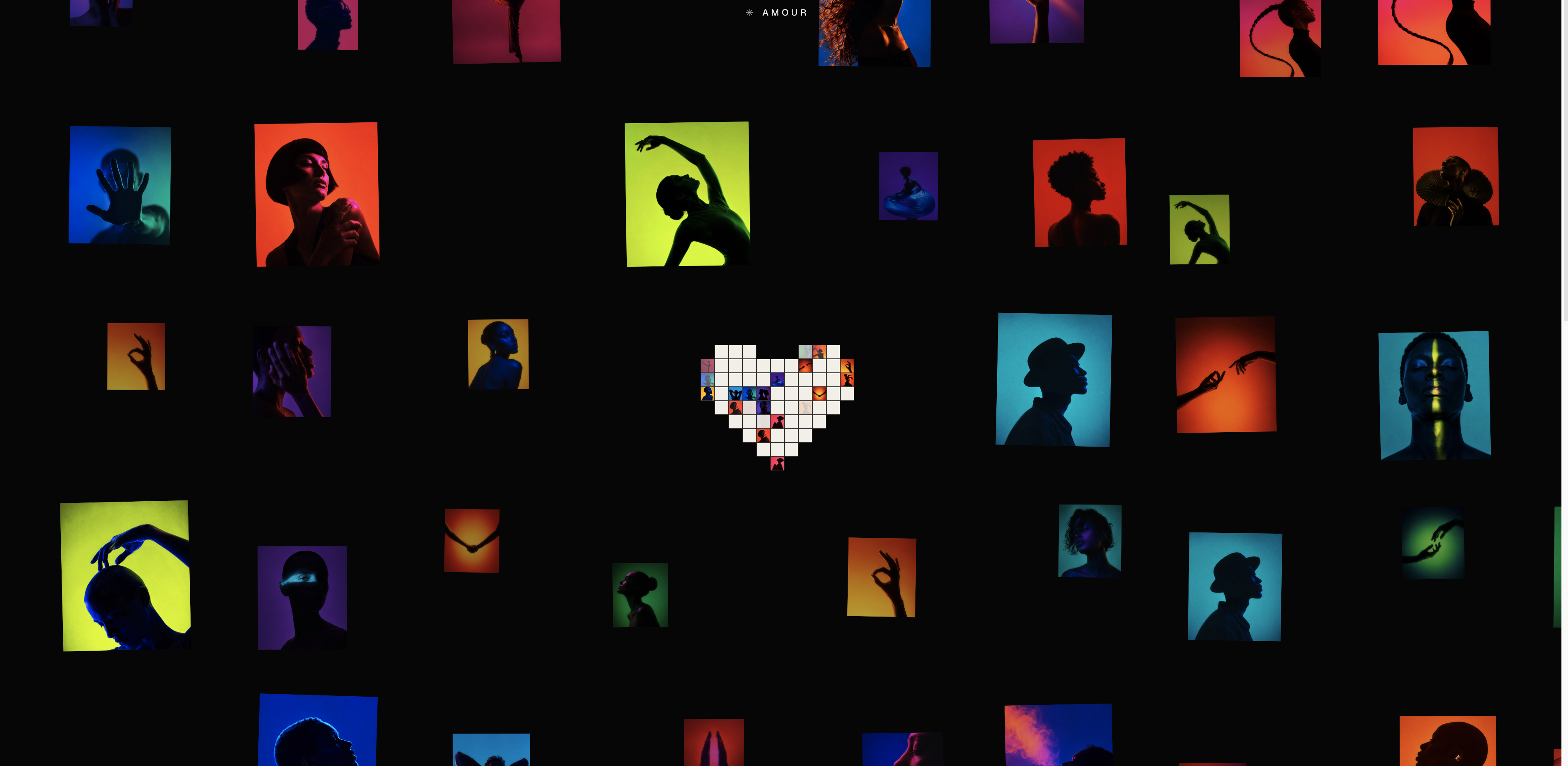 AmourA studio's entire archive, assembled into one shape and then taken apart into a wall. The section opens on BLACK — nothing on the stage, no spinner, no placeholder, because the photographs are already decoded and waiting below the frame — and then forty neon-lit studio portraits RISE UP out of the dark and settle into a MOSAIC HEART. They land row by row from the top down, so the lobes arrive first and the point finishes the shape, and the cells shrink as they descend on a written row profile rather than a constant ratio: the top TWO rows share one size so the lobes read as a single band of hero frames, the next two step down together, and everything below drops away fast into a fine point — three registers instead of nine faint gradations. The silhouette is built the way a PIXEL heart is built, from two separated discs and a tapering skirt, because the textbook implicit curve's cleft is too shallow to survive being sampled on a lattice — at any row height a mosaic can use, the notch has closed and the top row comes out as one solid bar. Here the notch is a measured one row deep and two cells wide, and each row's cell count is pinned by an editorial parity table, so the cleft and the hole appear in the same place on every screen instead of by accident. The middle of the heart is MISSING: exactly one cell of the third row is never dealt — sized to the cell rather than to the heart, so the centre photograph is removed whole and its six neighbours are untouched — and the frames that straddle the box are clipped against it, so the hole keeps a true rectangular edge instead of a mosaic's staircase. Then the hole FILLS. Single squares fly out of the surrounding photographs and settle into a second, much smaller heart with the same outer silhouette as the big one — an authored 11x9 piece of pixel art, symmetric because every row of it was WRITTEN as a palindrome rather than sampled off a curve, which is the only way a nine-column heart comes out with two equal lobes and its point on the axis. Most tiles land as white paper and a scattered few carry the photograph they left, so the small heart is visibly made out of the big one; and the tiles never stop turning over — each runs its own seeded clock, fading a photograph up, holding it, fading it out and going back to paper, so roughly a third of the heart is carrying a picture at any instant and the set is never the same twice. Then the heart BURSTS. Every photograph travels outward from the centre — the middle letting go first and the point last — until the mosaic has spread across the whole section as a WALL of frames at every distance, cropped by all four edges so it reads as continuing past the window, while the pixel heart grows with it and settles dead centre at the one spot the wall was solved to keep clear. NON-OVERLAP IS STRUCTURAL, not a collision test: every frame is contained inside its own grid slot, inset by half a gutter, so two frames cannot touch because their slots do not — and the frames near the heart are nudged WITHIN their own slots rather than evicted, which is what keeps the hole the size of the heart instead of the size of four slots. Depth is ONE number per frame driving four cues at once — how big it is printed, how sharp it is, how much of the room's dark sits in front of it, and what paints over what — biased toward the back, because near things are rare in a real room and an even spread of sizes reads as inconsistency rather than as distance. The split headline that framed the heart leaves as the wall arrives: type laid over fifty photographs is not type any more. Move the pointer and the photographs AROUND it lean toward it — the nearest furthest, the rest of the wall dead still, and the one directly under the cursor barely at all, because the pull points at the cursor and a frame it has already arrived at has nowhere to go; what you see is the ring around the pointer leaning in, the gesture of gathering something toward your hand. It is budgeted against the GUTTER rather than the viewport — two frames either side of the cursor close on each other by twice it, so the wall's no-overlap guarantee survives the pointer — and it is switched off entirely while the heart is whole, because a mosaic is a composition and cells dragged out of it are just a broken picture. Hover any frame on the settled wall and it lifts; CLICK it and that exact photograph GROWS OUT OF THE WALL and flies to the middle as a DETAIL CARD — it is not a card that appears over a wall, it is the photograph you pointed at, travelling, squaring up out of its lean and rounding its corners on the way — while the rest of the wall dims behind it and the card's serif name, verified tick, tag chips, collection pill and side rail cross-fade in only once the frame has stopped, because type sliding and scaling across a screen for half a second is unreadable. The arrow keys walk the wall without ever replaying the flight, so the keyboard never fights the animation; Esc or a click anywhere off the card sends the frame home to its exact slot. There is NO BLUR FILTER anywhere in the section — a canvas filter pass per draw stalls the main thread outright — so softness is a 32-pixel bake of each photograph cross-faded against the sharp original, which is free, is a better match for how an out-of-focus frame actually resolves, and pays three times over: the rise, the wall's depth-of-field, and the pixel heart's tiles all read off the same bake. ONE canvas, ONE requestAnimationFrame clock at fixed substeps, and the entire sequence is a pure function of a single elapsed-seconds scalar — GSAP owns nothing — so it can be scrubbed, replayed, or handed to a scroll position later without rewriting a beat. Black in both themes, because the photographs are the only colour on the stage and a bone-coloured version of this would put forty saturated frames on a light ground and lose the one thing the composition is doing. The whole mosaic re-solves for the board it is actually on — a wide solve and a tall one chosen by ASPECT rather than by width, since a portrait tablet and a landscape phone are the same width and want opposite hearts — measuring what it laid down and shrinking to fit rather than trusting the clamp, DPR-capped, pausing off-screen and in hidden tabs, and honouring prefers-reduced-motion by opening on the finished wall.
 - New
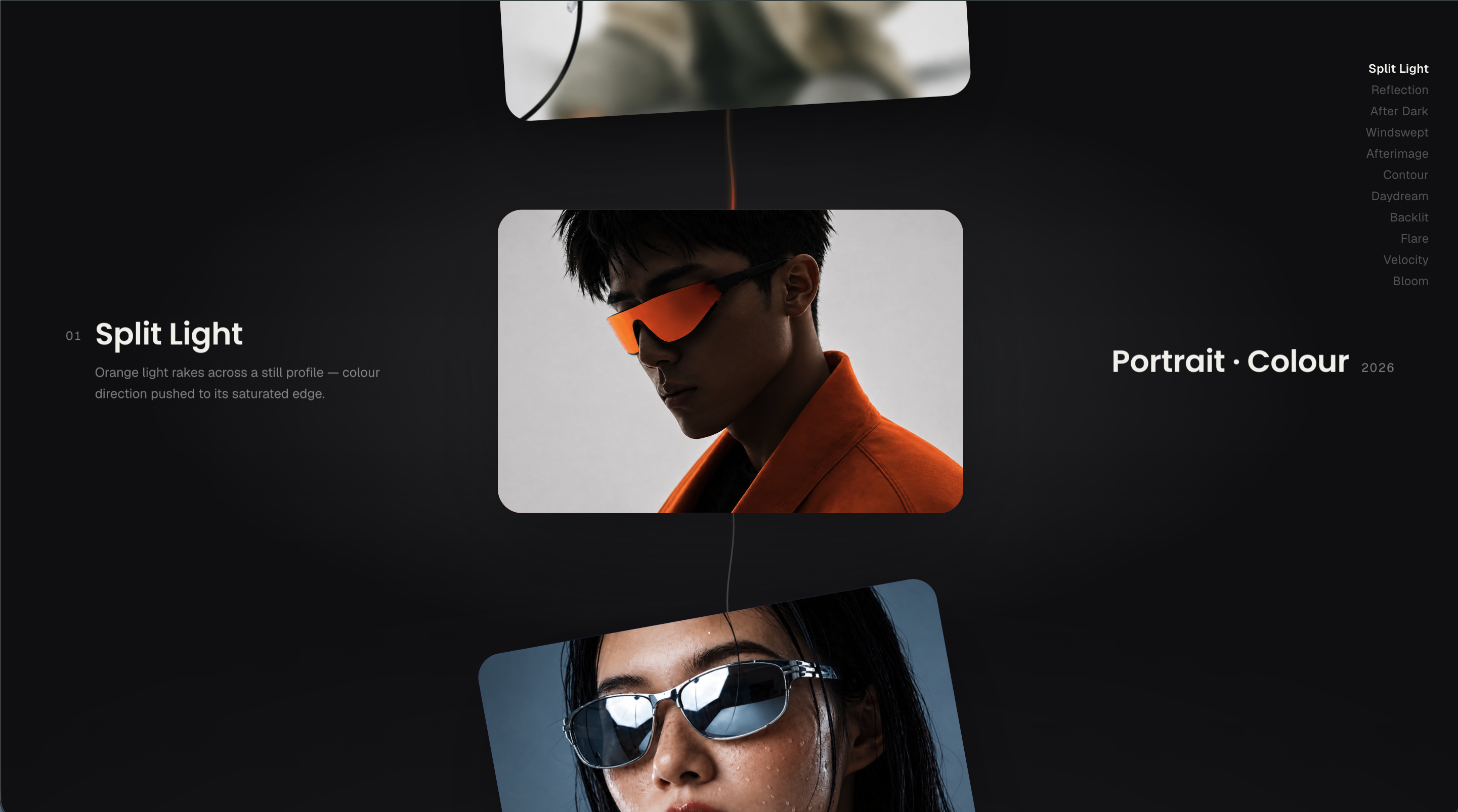 DimensionA photographer's works index built as a VORTEX that resolves into an endless CHAIN. Eleven photographs curl out of a single point at the centre of the screen and spiral outward into an evenly-spaced ring — each chip riding an angular swirl that unwinds as its radius grows, so the circle opens like a vortex decelerating into place, never a fan. The ring settles under the words ‘Works ’26’, breathing on a slow liquid undulation and drifting on an eased auto-spin, its chips linked by a single hairline thread, and it WAITS — no auto-advance, just a ‘Scroll’ cue in the corner. On the first scroll the ring zooms open and clears itself, handing the frame to a vertical chain: one photograph held full-size at the centre, the previous peeking in from the top and the next from the bottom, each linked to its neighbour by a slim coloured thread that inks its colour on as you arrive. Every scroll advances one work and the chain glides to re-centre; the rail is clone-padded so it loops FOREVER in either direction with no edge and no seam. The focus photograph is alive — a slow Ken-Burns drift and zoom, and a lift when the cursor is over it. The index of titles pins to the top-right and ticks the current work; the caption skews in like liquid — number and name to the left, discipline and year to the right — each time a new work lands. Click the centred photograph and it OPENS THROUGH AN IRIS: a circle grows out of the exact point you clicked, the photo counter-zooms as it fills the frame, and the editorial credit rises in line by line — title, discipline, year, a caption and the counter; click close or press Escape and the iris contracts back to the point it came from. On a phone the cards turn PORTRAIT and fill the screen, the focus card and its caption centred as one unit with the next card peeking off the bottom edge, and a swipe carries you through. Two palettes, light and dark, each with an ambient centre glow so neither is ever flat; no serif anywhere; a single physics loop owns the ring and the living photo while GSAP owns only the scripted beats — the spiral bloom, the shatter, the glide and the iris. Honours prefers-reduced-motion. Every constant, easing and timing is specified so it reproduces pixel-for-pixel.